Color

Our color palette brings warmth, clarity, and expression to the YouVersion brand. It creates a consistent visual language that helps people recognize and connect with YouVersion around the world.

YouVersion Red with a soft cream gradient blob.

Rooted in the Bible.

YouVersion Red draws from the visual language of Scripture—from the familiar red bookmark of the Bible App to the red-letter words of Jesus. More than a brand color, it connects our identity back to God's Word.

Red bookmark icon
The red bookmark is one of the most recognizable elements of the YouVersion brand and serves as the foundation of the Bible App icon.
16 For God so loved the world, that he gave his one and only Son, that whoever believes in him shall not perish but have eternal life.
Red is used throughout Scripture to highlight the words of Jesus, reinforcing the connection between the brand and God’s Word.
Red droplet icon
Beyond recognition, YouVersion Red reflects sacrifice, redemption, and the enduring story of Scripture.

The Core Palette

The primary palette includes YouVersion Red, supporting neutrals, and key accent colors used throughout the brand. Together, they create consistency across products, campaigns, and communications.

Name
YouVersion Red
HEX
#FF3D4D
RGB
255 61 77
CMYK
0 76 70 0
Name
Maroon
HEX
#7A2629
RGB
122 38 41
Name
Peach
HEX
#F8CB94
RGB
248 203 148
Name
Warm Neutral
HEX
#F6EFEE
RGB
246 239 238
CMYK
2 5 3 0

The Bible App icon served as the foundation for the YouVersion color palette. Its carefully selected colors influenced the development of the hero red, warm page tones, and supporting accent colors that now appear across products, campaigns, and experiences.
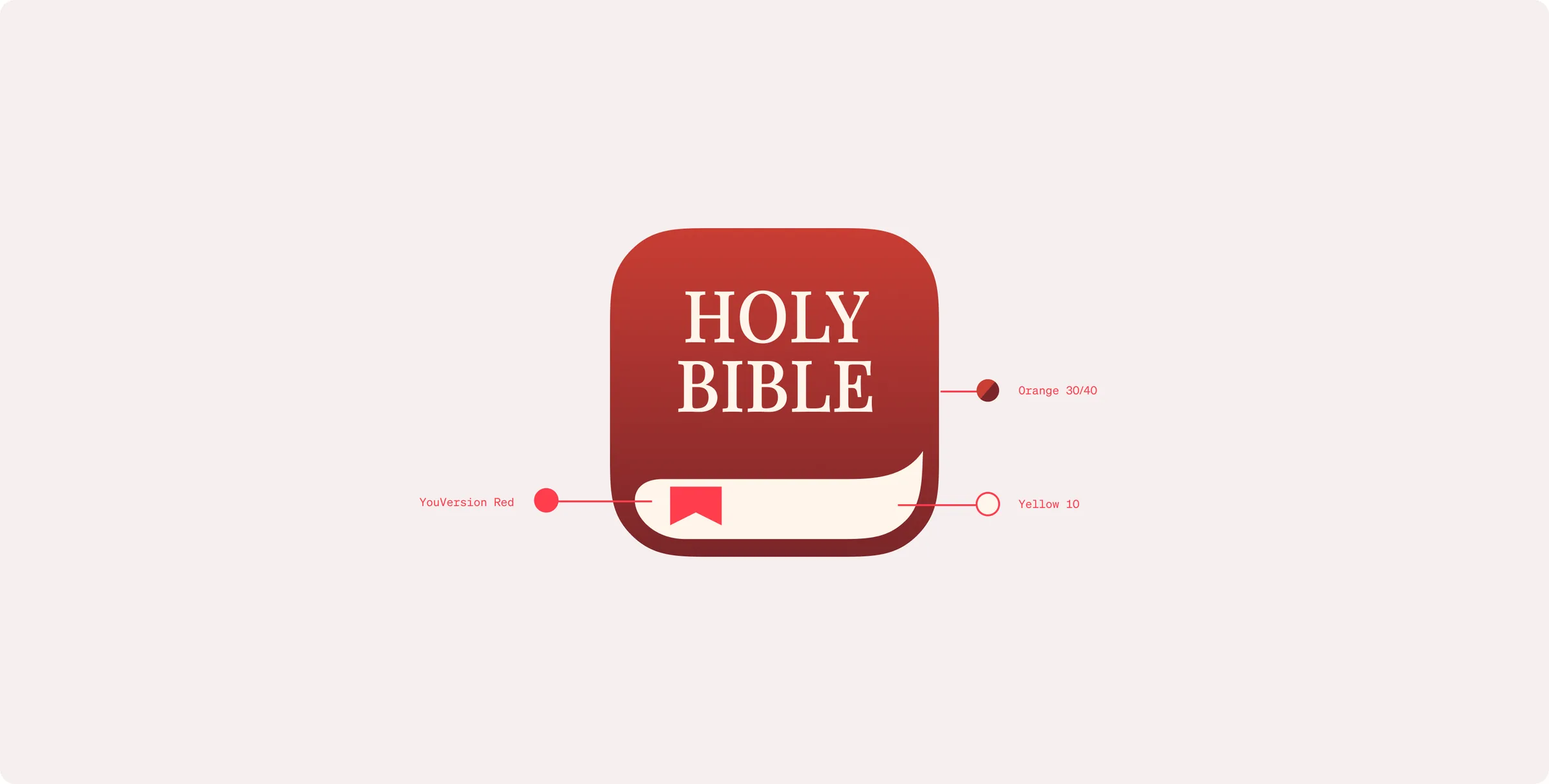
Bible App icon with callouts to YouVersion Red, Yellow 10, and Orange 30/40.
Grid of the Bible App icon localized in 66 languages, each a red book with a bookmark on a cream background.

Designed for Balance and Clarity

Warm neutrals provide structure throughout the brand, supporting typography, photography, interfaces, and content without competing for attention.

Name
White
HEX
#FFFFFF
RGB
255 255 255
CMYK
0 0 0 0
Name
Gray 5
HEX
#F6F4F4
RGB
246 244 244
CMYK
2 2 2 0
Name
Gray 10
HEX
#EDEBEB
RGB
237 235 235
CMYK
6 5 5 0
Name
Gray 15
HEX
#DDDBDB
RGB
221 219 219
CMYK
12 10 10 0
Name
Gray 20
HEX
#BFBDBD
RGB
191 189 189
CMYK
25 21 21 0
Name
Gray 25
HEX
#828080
RGB
130 128 128
CMYK
51 44 43 7
Name
Gray 30
HEX
#636161
RGB
99 97 97
CMYK
60 53 52 23
Name
Gray 35
HEX
#474545
RGB
71 69 69
CMYK
66 60 58 43
Name
Gray 40
HEX
#353333
RGB
53 51 51
CMYK
68 64 62 58
Name
Gray 45
HEX
#232121
RGB
35 33 33
CMYK
70 66 65 73
Name
Gray 50
HEX
#121212
RGB
18 18 18
CMYK
73 67 66 82
Name
Black
HEX
#000000
RGB
0 0 0
CMYK
—

Designed for Expression

The expressive palette introduces additional flexibility for storytelling, campaigns, and product experiences while maintaining a cohesive connection to the core brand.

“Together for the One” in cream serif and grotesk type over a dark, blurred gradient of purple, teal, and orange.